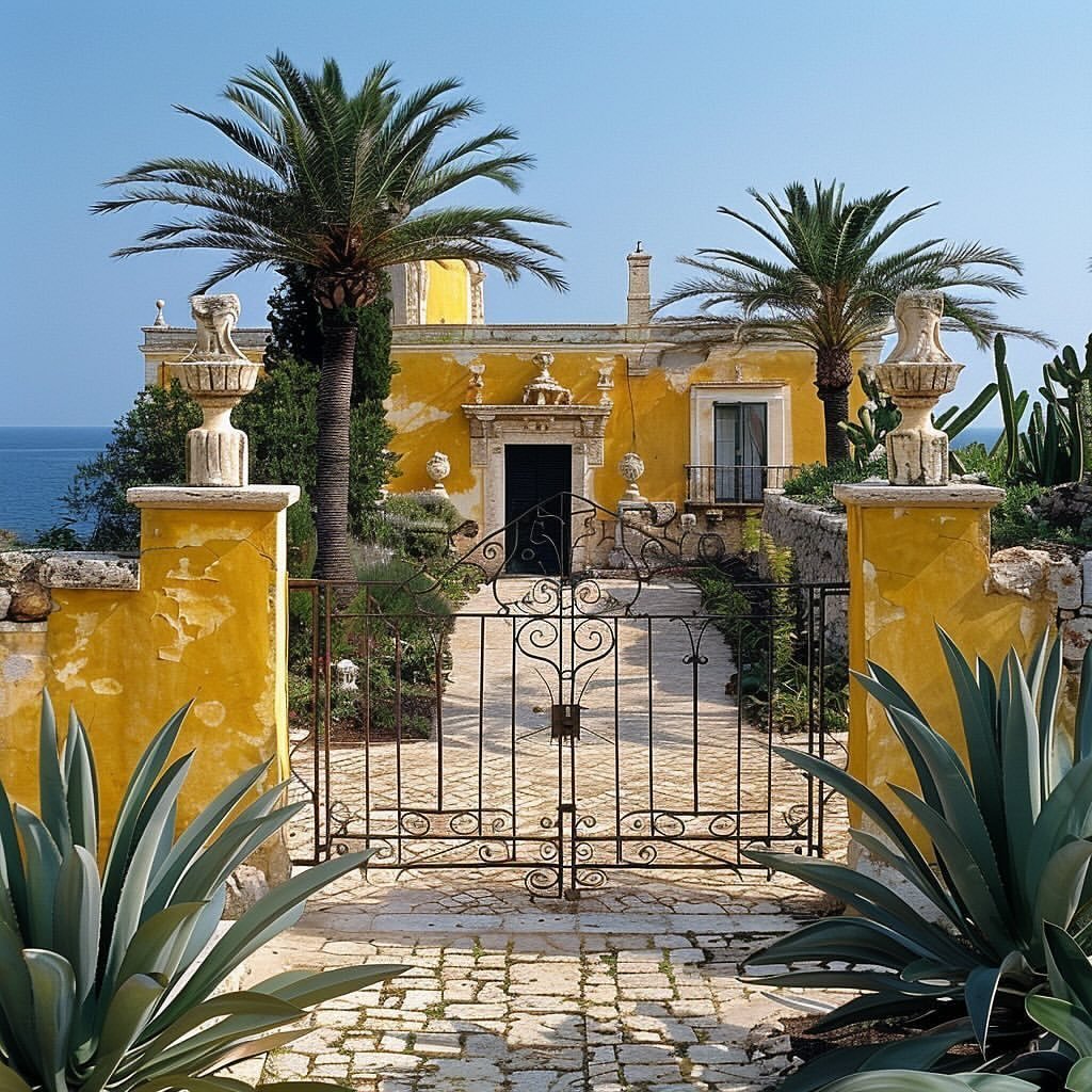
Have you ever walked into a room and suddenly felt uplifted or calmed down? The cause could be color—a powerful force that subtly influences us but significantly in our moods and behaviors. In interior design, this then becomes a vital aspect of the skill of understanding color psychology to design spaces that breathe desire.
By understanding how different colors influence us, you can create intentional spaces that resonate with your desired mood. Let’s delve into the psychology of some popular colors and how to use them to craft your dream atmosphere:
In Full Color Emotions
Here’s a bit of insight into what some of the essential colors mean to our psychology and how you can make the most out of them in your design scheme:
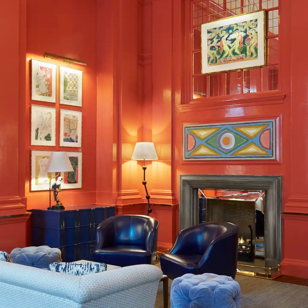
Reds and Oranges: The fact radiating warmth and energy, now one can show such feeling and ignite the house’s charm by increasing creativity levels in a home office, or one can just have a chat in the living room through vibrantly bold colors on the accent walls, or even a fiery artwork.
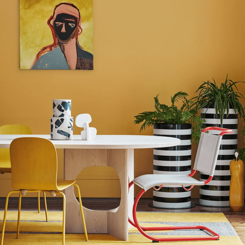
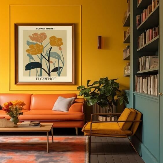
Yellows: Uplifting and cheery, yellows bring a little touch of sunshine indoors. They work pretty well in kitchens, breakfast nooks, or playrooms to uplift and help increase mental productivity.
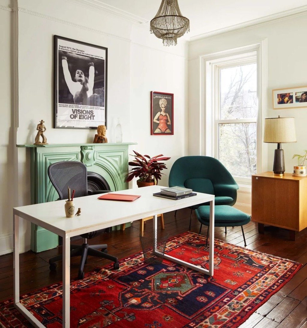
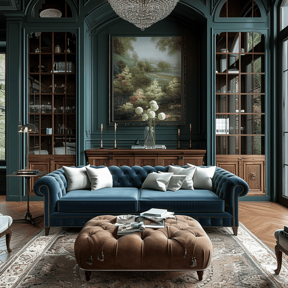
Blues and Greens: These are cool colors, representing tranquility, peace, and focus. Such color shades would be appropriate for living rooms, bedrooms, bathrooms, or meditation rooms. Lighter shades create a sensation of roominess, while deeper tones create a feeling of security and trust.
Purples: Representing luxury, creativity, and wisdom, purples bring sophistication. Deep purples would go very well with home theatres or libraries, whereas lavenders set a calming atmosphere in bedrooms.
Neutrals: Whites, beiges, and grays give a sense of balance. These are perfect neutral canvases to which you can add some other bolder colors. They form a great base to get a simple and clear look, thus giving prominence to different factors in design.

Beyond the Basics: Color Combinations
So it’s good to know what emotions individual colors evoke, but the magic is in understanding color combinations. Some good ones include:
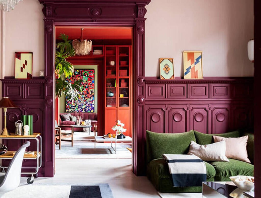
Complementary Colors: Making a high-energy contrast on the color wheel, complementary colors sit right opposite each other. Think red and green for a stimulating workspace or orange and blue for a dynamic living area.

Analogous Colors: Analogous colors lie right next to each other in the color wheel and offer a harmonious, cohesive feel. A calming palette of blues and greens can work incredibly well for a spa-like bathroom, while warm yellows and oranges create a cozy ambiance in a living room.
The Art of Light and Space
Do remember that color psychology is not something rigid. Think about how light marries up with color. A south-facing room flooded with warm daylight might be balanced with cool-toned colors. Also, consider the size of the space: light colors make a small space look more open, while darker ones make a large room warm.
Conclusion: Design Intention
Now, you can style a space that radiates beauty and complements your emotional needs. One creates a haven according to one’s personality through color psychology by understanding the language of colors and trying different mixes. So unleash that inner artist, embrace the colorful world of interior design, and create a space that speaks to your soul.